FSC Curve Interpretation
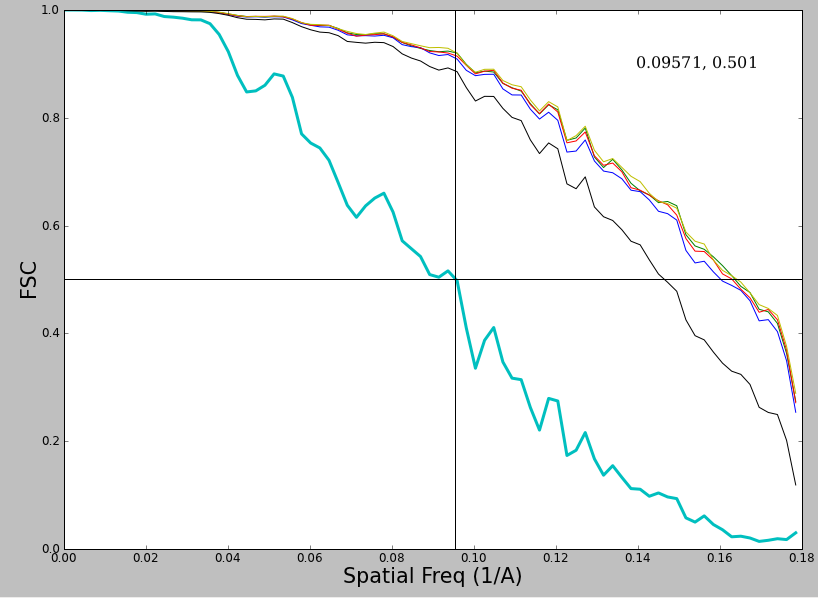
If you double click on on one of the items under 'resolution' in the workflow, ideally you will see a curve that looks like :
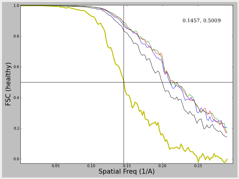
What do we see in this plot ? First, and foremost is the thicker yellow line (not always yellow, but always thick in EMAN2). This curve represent the FSC (Fourier shell correlation) between two maps generated by reconstructing the even and odd halves of the particle data separately. Note I say separately, NOT independently. Ideally to assess both resolution and model bias, the data should be split into two halves, and completely independent reconstructions run, with different starting models for each reconstruction. A comparison of these two models will then assess not only the resolution (noise level) in the final model, but also the reproducibility of the results. However, in practice, nobody does this, or if they do, they rarely publish the results. Why ? Well, of course, the 'resolution' determined in this way will always be worse than the resolution as determined using the simpler test shown below. This test does NOT assess model/noise bias, but only assesses the noise levels present in the final reconstruction. This curve is typically generate by taking the final refinement orientation parameters, but only doing the actual 3-D reconstruction using even or odd numbered particles. In EMAN2 we actually take one further step towards the 'full' resolution/bias step, and the 2-D alignment parameters are recomputed for the even and odd 1/2 of the particles using EMAN2's iterative class-averaging procedure. This makes the test marginally more realistic than the most simplistic test.
When evaluating the resolution of a map, one typically measures the spatial frequency at which the FSC curve first falls below some value. The big question is WHAT value ? This has been the topic of a great deal of debate in the CryoEM community over the last 3 decades, and there continues to be no single answer to this question. At the NCMI, we have historically used the 0.5 criterion (shown by the crosshairs in the plots). Using the relation SSNR=2*FSC/(1-FSC) (Unser, M., et.al. (1987), Ultramicroscopy 23, 39–51) we see that a FSC value of 0.5 corresponds to a SNR of 2.0 at the cutoff resolution. So, the question is, why 2.0, why not 1.0 ? Our reasoning for using 0.5 has little to do with the specific SNR value it corresponds to but due to the reliability of the number. As you will observe below, various effects can produce FSC curves which are 'unhealthy' in various ways. If you use one of the other criteria with lower FSC thresholds, the resolution value you determine will be very sensitive to such artifacts. With 0.5, even if you do something like over-mask your data, it will have only minimal impact on the resolution. That is, it produces a reproducible value, even if by some estimates it underestimates the true resolution of the data. Additional arguments have been made for using cutoffs of 0.33 (corresponding to a SNR of 1.0 under an even/odd test), or 0.143 which corresponds to the threshold value used in X-ray crystallography (Rosenthal, et.al. (2003) J. Mol. Biol. 333, 721-745.) as well as variable criteria which take symmetry and sampling into account.
Note that this plot also contains several colored thinner lines. In fact, if you open the resolution plot before running e2eotest.py, you will see something like:
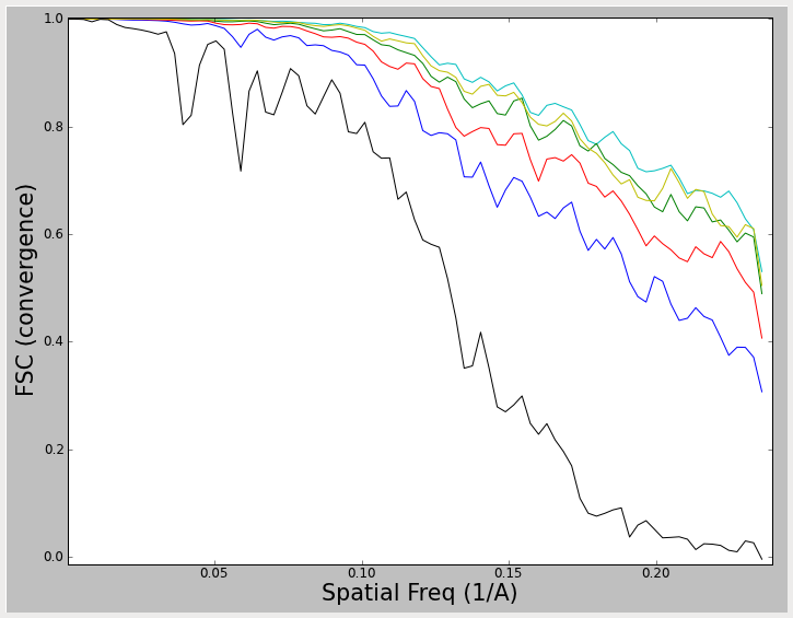
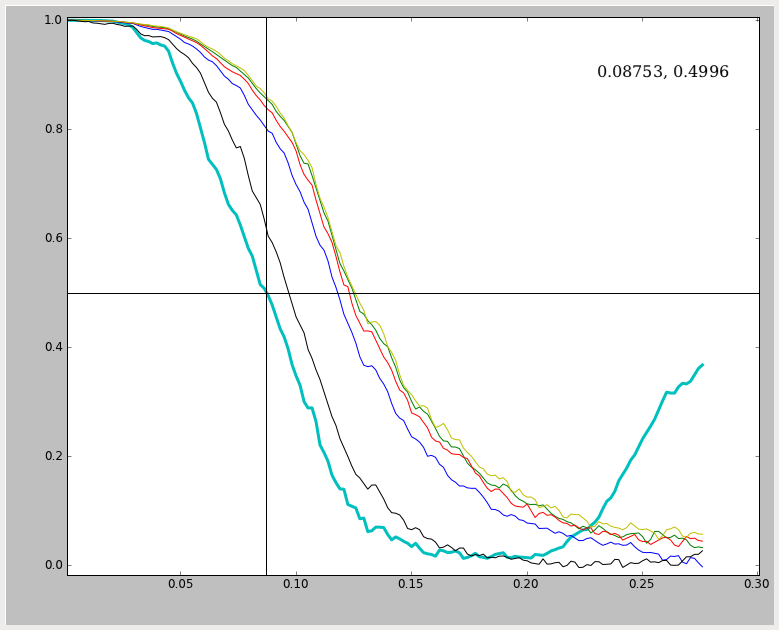
These lines do NOT represent even/odd test results which can be used to assess resolution, but rather represent a 'convergence plot'. In this plot, the FSC is computed between each iteration and the previous iteration. The thin black curve, for example, represents a comparison between the initial model and the model produced after 1 round of refinement. The blue curve shows a comparison between round 2 of refinement and round 1 of refinement, etc. That means that if your reconstruction has completely converged, and all particle alignment parameters are staying exactly the same from one iteration to the next, you will see these curves rise to 1.0 (at all spatial frequencies). In reality, of course, there is noise, and the noise prevents true convergence from happening if reasonable parameters are used. What we hope to achieve is a pseudoconvergence, where the curves from one iteration to the next remain basically the same. This was achieved in the first plot shown above. In the second plot, the results have almost converged, but could probably use a couple of additional rounds of refinement. The most important message here is that the 2nd plot above cannot be used to assess resolution. It is strictly a measure of convergence. To measure resolution, you need the darker line produced by an even/odd test.
Unfortunately, the even/odd tests don't always produce resolution curves as healthy as the one shown in the first plot. In fact, you may often see something more like:
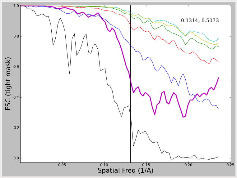
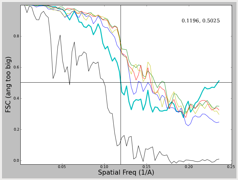
Note that in these 2 examples, the FSC curve does not fall all the way to 0, and in fact rises at high spatial frequencies. What produces this effect, and what to do about it ? The first of these curves was produced by using a very tight mask around the model during iterative refinement. This mask cuts through some of the density in the model producing a sharp edge such that the mask itself is correlating. The second curve is generated by using a very large angular step when generating projections. That means that the sampling of Fourier space at higher resolutions is incomplete, which produces a similar effect. In both cases this produces a curve which falls to some level, then begins rising again. In the overmasking case, the resolution at 0.5 (which can still be assessed) is exaggerated a bit. In the case of the too coarse angular sampling, the resolution is not really exaggerated at 0.5. In both cases, it would clearly be impossible to determine the resolution at a lower threshold value. Regardless, such curves are 'unhealthy' and you should not try to publish such results, but rather rectify the underlying problem first. There are other artifacts which can produce similar effects. One fairly good description of these issues can be found in (Penczek, P.A. (2010) Methods. Enzymol. 482, 73-100).
Now, what about this plot ?
This plot is actually quite healthy, but has 2 effects which people often dislike. First, the FSC curve itself is jagged looking. While it is possible for this effect to arise from sampling issues, typically it is real, and is due to inadequate sampling of defocuses when collecting data. The peaks represent points where the summed SNR from all of the different images is weaker or stronger due to the shape of the CTF curve. Second, the falloff of this curve appears to be fairly gradual rather than sharp. This is also not a problem, and you will see this sort of variation depending on the symmetry of the object and the envelope function of the microscope.
This curve:
is another useful example to consider. The curve in this case falls all the way to zero, but eventually begins to rise again. This is, again, due to insufficient angular sampling. However, since the effect is not cutting in until well beyond the determined resolution it is effectively harmless, and not producing an exaggerated resolution value. When you see this effect it generally means that you oversampled your data too much (A/pix was smaller than it optimally could have been). While the effect is harmless, it is still not something you want to include in a publication. If you observe this effect you pretty much have 2 choices: decrease the ang= parameter and simply wait for a long refinement to finish (you probably want to make sure you're using 2 stage refinement) or go back to the beginning of processing and shrink your data so it isn't using such a small A/pix value.
